
Fonts for e-readers → PT Serif
PT Serif
PT Serif was made by ParaType as part of the Public Types of the Russian Federation project. It has the familiar look of a printed book. It is a little lighter than the others, so pick a larger size on e-ink.
Все счастливые семьи похожи друг на друга, каждая несчастливая семья несчастлива по-своему. Всё смешалось в доме Облонских. Жена узнала, что муж был в связи с бывшею в их доме француженкою-гувернанткой, и объявила мужу, что не может жить с ним в одном доме.
Call me Ishmael. Some years ago — never mind how long precisely — having little or no money in my purse, I thought I would sail about a little and see the watery part of the world.
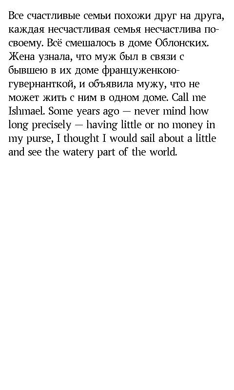
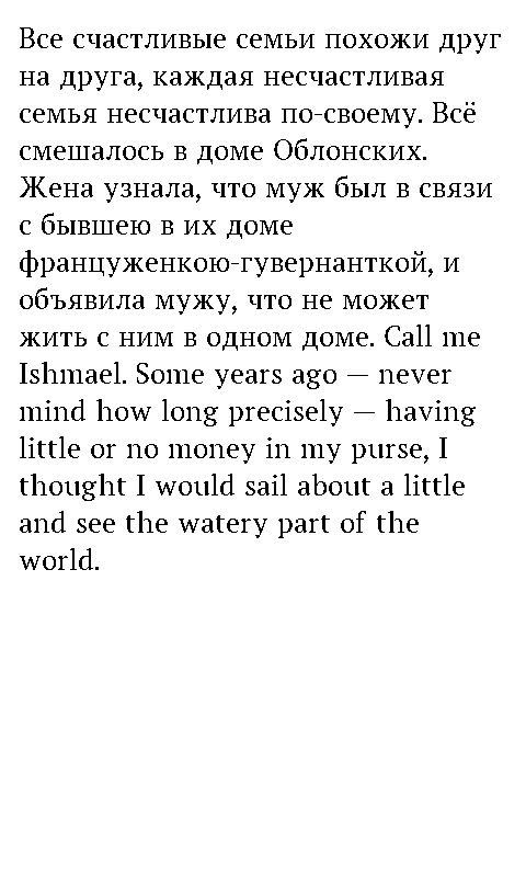
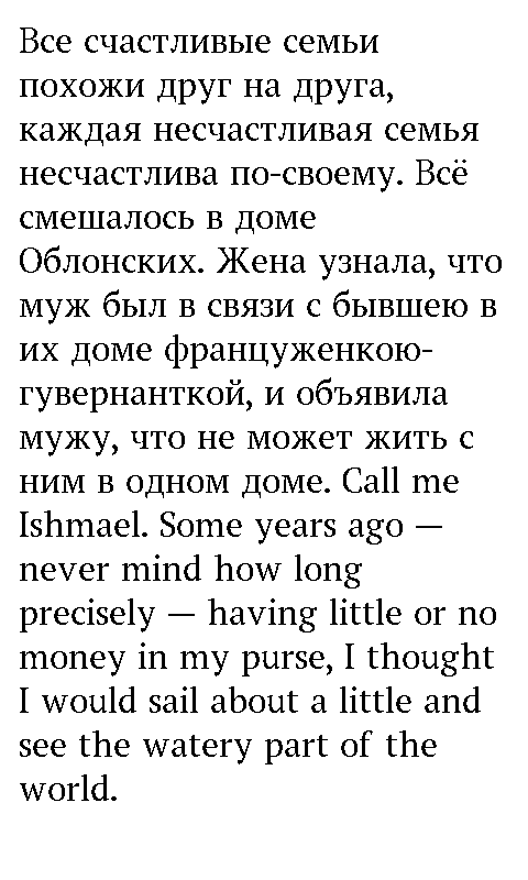
How it looks on Xteink
A 480×800 black-and-white page, as on the X4 screen. This is roughly how the font looks on e-ink.
Download for my e-reader
Pick your e-reader to see the right files and how to install them. Your choice is remembered.
- Download the -Regular.ttf file to your phone.
- Open the XTEINK app, tap “+” → Import → Font Import and pick the file.
- Choose the font on the reader. The size is changed in the reading settings.
- Pick a size: 22–24 px for small text, 26 px for medium, 28–32 px for large. Each size is a separate file.
- Download the .bin file of that size and copy it to the fonts folder on the memory card.
- Choose the font in the reader settings.
The size in the file name is the character cell in pixels. Each file downloads on its own, there is no archive to unpack.
- X4 Pro: download the 4 .ttf files and put them in the fonts/PTSerif/ folder on the memory card.
- Regular X4: download the .cpfont files of all sizes into the same folder.
- Choose the font in Settings → Reader → Font Family, the size in Font Size.
X4 Pro: 4 TTF files
Regular X4: .cpfont files
- Connect the Kindle (firmware 5.9 or newer) to a computer.
- Copy the 4 .ttf files into the fonts folder at the root and eject the reader.
- Open a book and choose the font in Aa → Font.
- Connect the Kobo to a computer and create a fonts folder at the root.
- Copy the 4 .ttf files there and safely eject the reader.
- Choose the font in Aa → Font.
- Copy the .ttf files to system/fonts in the internal memory.
- Restart the reader and choose the font in the reading settings.
- Copy the .ttf files to the fonts folder at the root of the memory.
- In NeoReader choose the font in Format → Font.
- Copy the .ttf files to koreader/fonts/ (on Kobo it is .adds/koreader/fonts/).
- Restart KOReader and choose the font in the text menu.
- Download the .ttf files and open them: the system will offer to install the font.
Menu names depend on the model and firmware. Design: ParaType. License SIL Open Font License 1.1 (OFL.txt).